Teaser Trailer in Site Updates
- July 15, 2015, 12:18 a.m.
- |
- Public
A while back I hinted about changes to the site involving a massive design change. I believe there was also an entry warning you that you might wake up one morning and see a totally different site with no warning at all.
And yet, here I am offering up a sneak preview.
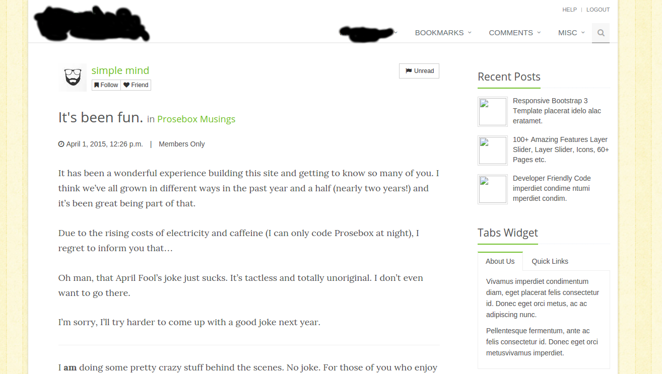
I’m still working behind the scenes, spinning the clay and carefully sculpting what I hope is a slightly cleaner and improved design for the site. And yes, there will be some amount of personalization for larger displays, that doesn’t interfere with readability.
Something like this:
(click to see full size)
It’s pretty much going to look more like a personal blog, I think.
Please ignore the unsightly ink blots. I’m keeping any potential name changes under wraps for now. :)
And yes, others will be able to see your personalization choices, if they so choose. If people want to opt out and go with all white or all black, that will be an option as well.
I’m not going to be maintaining a whole slew of themes similar to the current setup. There will just be white and dark, with the option to box it in like the example above and choose a wallpaper. I’ll probably just grab a wide assortment of tiles that can be hosted on the site, and possibly look at a more deluxe option to choose what images you host and use as a premium subscription option. Someday!
And as I said before, it’s a work in progress. You’re not seeing a finished product yet.


Loading comments...